The aim is to improve the complete passenger journey to become Europe’s preferred airport
The challenge
How to improve the pessanger journey to create higher pessenger satisfaction.
My Role
I did customer research by doing interviews and usability testing in the terminal with passengers waiting on their plane. I helped translate these findings in UX-concepts.
The Strategy
In the preliminary phase, we conducted an extensive user survey. We started with customer first research and found that users needed more control. We translated our findings into three principles: relevance, tranquility and overview.

Relevance

Tranquility

Overview
Based on that, we restructured user groups, streamlined processes and designed more self-service capabilities.
The Design
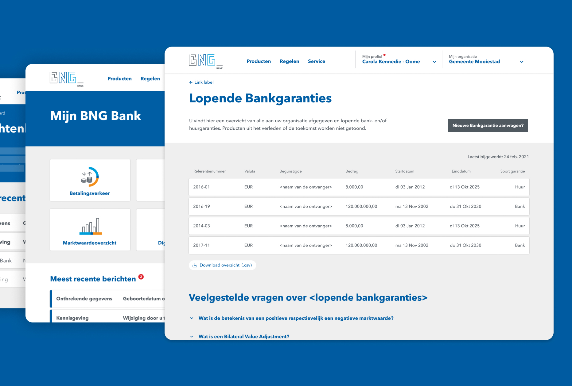
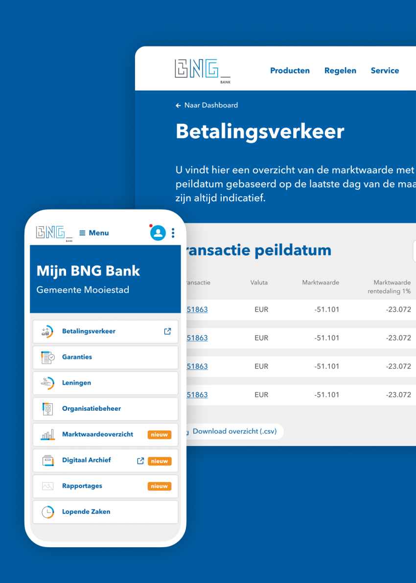
The principles (relevance, tranquility and overview) are reflected in the solid UX design, with a harmonious coherence between the various components: a limited color palette, clear typography, recognizable signposts and clearly presented information in accessible language. So that you as a user always know where you are and where a certain action leads.
The Result
The new customer portal forms a strong foundation for the future. Both customers and employees experienced added value immediately after going live. The digitized processes increase the service level, reduce the pressure on the organization and lower operational costs. And also contribute to the environmental friendliness of the government bank by using less paper.